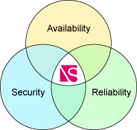
The Dashboard provides a convenient snapshot of your network performance including network Health (Availability), Reliability, and Security. The top right display area shows you the open trouble tickets (Tickets Affecting Network Health) based on the managed product area you selected. You can set your view by clicking the product category tab button (Combined, WAN, LAN, IP Telephony, Server, and Security). Setting your view to a specific product displays only those tickets affecting those products. By clicking on a column title, you can sort tickets in the list. Clicking again reverses the sort order.
Example:
.gif)
NOTE: Clicking the ticket number opens individual tickets in the Network Details >Trouble Tickets sub-tab.
The Network Health shows the percentage of devices in the network that are functioning properly over the total number of devices. You can select the timeframe for the information, such as the present (Current), the previous day (Yesterday), the average for the last 7 days, or the average for the last 30 days.
Reliability provides you a view of the network trend for availability over time. Possible reliability trends are represented by arrows as shown in the following table:
|
Reliability Risk |
Icon |
|
Improving - Positive trend |
|
|
Unchanged - Neutral |
|
|
Degrading - Negative trend |
|
NOTE: Colors presented in the icons are associated with the device availability percentage. Green is positive; yellow is caution; and red is negative.
You can select the timeframe for the information, such as the last 30 days, last 180 days, or last 365 days.
By clicking View tickets affecting reliability over the selected time period, you can generate a list of all tickets that meet those criteria. You can open Individual tickets in the Network Details >Trouble Tickets sub-tab by clicking the ticket number. Clicking the icon opens a reliability graph in a separate window that shows the reliability percentage data points for each day over the selected time period.
Security is a directional trend based on the number of events affecting the network security and the impact level of the events as measured over the last 30 days. Possible trends are represented by arrows as shown in the following table:
|
Security Risk |
Icon |
|
Improving - Positive trend |
|
|
Unchanged - Neutral |
|
|
Degrading - Negative trend |
|
NOTE: Colors presented in the icons are associated with the device availability percentage. Green is positive; yellow is caution; and red is negative.
By clicking View tickets affecting security, you can open a list of the tickets affecting security risk over the last 30 days. You can open Individual tickets by clicking the ticket number. Clicking the icon opens a security risk graph in a separate window that shows you the security risk percentage data points for each day over the past 30 days.
Related topics:
Navigating Exchange and Viewing the Network Status